
Organising the sitemap for a professional website means deciding which pages to create, how to link them together and how many levels deep to place them. Since 28 June 2025, the European Accessibility Act has also required businesses to consider user journeys (search, forms, payment) from the design stage, putting site architecture at the heart of the legal obligations for the online stores concerned.
Click depth and internal linking: two challenges site architecture must address
Most sitemap guides focus on the list of pages to create. The real issue comes earlier: how many clicks separate each page from the homepage, and how the pages link to one another.
A professional website should aim to keep its structure to a maximum of three levels. Beyond that, visitors drop off and search engines are less likely to index deeper pages effectively. In practical terms, a user starting from the homepage should be able to reach any service or content page in no more than three clicks.
Internal linking complements this vertical structure with horizontal links. A “service A” page can link to a “case study” page, which in turn links to the “contact” page. This network of internal links distributes SEO authority and guides visitors without requiring them to return to the main menu. The Bertrand Barré sitemap illustrates this approach by making all the pages and their hierarchy visible at a glance.
Every orphan page is invisible to search engines. Before creating a new section, make sure at least two other pages on the site link to it.

Website sitemap structure: group pages by intent, not by internal department
The most common mistake when organising a professional website is to base its structure on the company’s organisational chart. Visitors don’t know your departments. They’re looking for an answer to a specific need.
Categories based on visitors’ questions
Group pages according to your users’ search intent. A consultancy offering recruitment, training and auditing services could structure its menu around three questions:
- What problems do you solve? (service pages grouped by client needs rather than internal expertise)
- How do you work? (methodology page, case studies, testimonials)
- How can I contact you or request a quote? (contact page, form, appointment booking)
Organising pages by intent reduces the number of categories in the main menu. A navigation menu limited to five or six items remains easy to read on mobile and makes it easier for visitors to choose where to go.
Name pages with SEO in mind
Each page name in the site structure becomes its URL, its menu label and often its title tag. Use terms your visitors actually type into a search engine. “Our solutions” tells Google and potential customers very little. “Energy audit for businesses” or “Remote management training” includes the keywords people search for and clearly signals what the page is about.
A page name should make sense out of context, whether it appears on its own in a search result or in a link shared on social media.
Accessibility and consent: two often-overlooked layers of a sitemap
Since the European Accessibility Act came into force, e-commerce websites aimed at consumers must make complete user journeys accessible, not just information pages. This includes login, internal search, form and payment steps. Some microenterprises providing services are exempt.
For a professional website being built or redesigned, this means incorporating accessibility criteria into shared templates from the site-architecture stage. A poorly coded menu button or a contact form that cannot be used with a keyboard can make the entire journey inaccessible, regardless of how well the rest of the site is structured.
The cookie settings link should be included in the permanent navigation, usually in the footer. In France, refusing trackers must be as easy as accepting them, and users must be able to change their choice at any time. Planning for this access from the outset avoids having to add it later in a hard-to-find location.
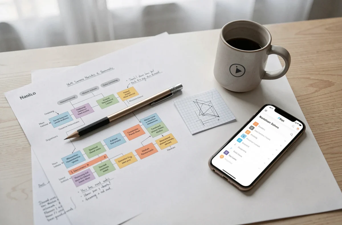
Pages to include—and pages to avoid—on a professional website
Many business websites are tempted to create too many pages: one for each service, one for each team member, one for each city served. The result is a bloated sitemap full of thin-content pages that dilute domain authority and make navigation more complicated.
Pages worth including on a typical professional website:
- Homepage, directing visitors to the main categories in two or three clicks
- Service or product pages, grouped by customer intent and detailed enough to answer common questions
- “About” or “Who we are” page, establishing the company’s credibility
- Contact page with an accessible form and direct contact details
- Legal notices and privacy policy, required in France
Combine pages rather than creating lots of short ones. Two related services are better presented on one substantial page than on two pages with three paragraphs each. Search engines favour detailed content that covers a topic in depth.
Where the blog fits in the site structure
A professional blog can support SEO, provided each article targets a specific search query and links to the relevant service pages. Placing it at the same level as the main categories in the navigation keeps it accessible without adding depth. A blog buried two menu levels down will eventually stop receiving internal visits.
How often to publish depends on the resources available. A site with three well-ranked articles brings in more qualified traffic than a blog with fifty articles and no keyword strategy. A stable sitemap with a small number of strong pages is better than a constantly changing structure that is revised every month.
The structure of a professional website should be planned before the first line of code is written. Limited depth, grouping by intent, search-focused naming, accessible user journeys and a lean page count provide a framework that works for businesses of any size.